Friday, 23 April 2010
OCR Copyright Policy
Any use of music in this film complies with 'Fair Dealing' under the 1988 Copyright Designs and Patents Act (UK), Sections 6(i) and 6(ii);
Fair dealing is a term used to describe some limited activities that are allowed without infringing copyright. Briefly these are as follows:
Section 6
i. Research and private study
Copying parts of a literary, dramatic, musical or artistic work or of a typographical arrangement of a published edition for the purpose of research or private study is allowed under the following conditions:
· The copy is made for the purposes of research or private study.
· The copy is made for non-commercial purposes.
· The source of the material is acknowledged.
· The person making the copy does not make copies of the material available for a number of people.
ii Instruction or examination
Copying parts of a literary, dramatic, musical or artistic work or a sound recording, film or broadcast for the purpose of instruction or examination is allowed under the following conditions:
· The copying is done by the student or the person giving instruction.
· The copying is not done via a reprographic process.
· The source of the material is acknowledged.
· The instruction is for a non-commercial purpose.
My Website
 This is my final website created on PhotoShop and displayed on a website format using DreamWeaver
My Magazine
 This is my final magazine cover with all changes that I have made using conventional codes and conventions related to "Empire Magazines".
Thursday, 22 April 2010
Website Production Progress Report

(Updating my progress report)
Now the pre-production is complete and I have put all my needed images into a folder. I began to contruct my website using PhotoShop. My photoshop skills at this point are very advanced. This is due to using photoshop in my own time practicing and working on my magazine using photoshop. I did have a few problems when attempting to make my image of my protagonist slightly transparent and faded. However help from my teacher and group mates help me overcome this problem. I loaded up all my images onto my black background and began to merge my images. There were no more further problems at this stage and I produced my website how I wanted it. I then exported this as a web device.
Now the pre-production is complete and I have put all my needed images into a folder. I began to contruct my website using PhotoShop. My photoshop skills at this point are very advanced. This is due to using photoshop in my own time practicing and working on my magazine using photoshop. I did have a few problems when attempting to make my image of my protagonist slightly transparent and faded. However help from my teacher and group mates help me overcome this problem. I loaded up all my images onto my black background and began to merge my images. There were no more further problems at this stage and I produced my website how I wanted it. I then exported this as a web device.
Website Pre-Production Progress Report
My website begun shortly after completing my magazine. I began with research as my knowledge on creating a film website is fairly limited. I researched into Web2.0 designed websites and briefly looked into 5 film websites for different codes and conventions towards the beginning of the year.

The next stage was to focus on 3 websites in depth of my chosen genre which is thriller. I learnt alot of the codes and conventions and styles of the websites, for example the style of the credits, colour schemes and types of images.
I looked through my images that I took when filming my trailer and decided on a picture which suits the codes and conventions. I then decided on titles and other elements for my website. I encluded pre-production work showing my narrowed down choices and what I had chosen to include in my website. There were no problems here. I think my pre-production has been done properly and I have included everything I need to help construct the production of my website.
Evaluation For My Radio Advertisment

My Radio Advertisment was created on Adobe Audition which is an advanced sound production program. This production took me a while as I have not had an experience using it. To begin with I Gathered my raw sound recordings which I had recorded previously in the sound recording booth. In the sound recording booth we also used adobe audition however it was not my job to use it as I was in control of the script and actors. I started by uploading my sounds onto the software program and listening to them checking they were correct. I then begun to crop them and cut any unwanted noises out. My next stage was to alter the sound levels. This took me a while to work out as my skills using this program were very inexperienced. My group and I also decided to use the doom which was used in the trailer. We put this at the beginning and the end so my target audience would recognise it. The main reason we did this was due to the fact that this project is a viral campaign therefore making as many links as possible between the products would help us become more successful and recognisable. Putting the radio advertisment together took me approximatly 1 hour. Our backing track we decided would be a heart beat. This helps add to the diegesis of my product adding tension and suspence along side the riddle. One problem we had was the tempo of the heart beat. The majority of our time was used cutting the gaps between the beats and fastening and slowing down sections so the end result was build up. This is shown on my printscreen above. Our script was based on previously heard radio advertisments and research which helped produce this conventional approach. After putting all this together we listened through it 3 times to make sure it is what we wanted. The next stage was to export my groups product as a audio file so we could then attach it to the internet and link it to our blogs with the evaluation and pre-production.
Tuesday, 20 April 2010
Programs Used For My Coursework
 This piece of software has allowed me to construct my trailer. Last year at AS level I used a more basic peice of software with limited effects and options for me to create a professional outlook on my coursework. This year I have been able to use Adobe Premiere to create an even more advanced piece of coursework improving my knowledge. This enabled me to have more effects, transitions and font sizes. There was also more freedom for me to move and crop my clips without getting confused. Overall Adobe Premiere was a brilliant advantage to my coursework.
 This was originally going to be used to construct my website, however we decided to use Photoshop. I have used Dream Weaver to present my website in a web-based format allowing me to view my website as if it was real.
 Adobe Audition was used for two sections of my coursework. Firstly for my trailer. I used this program in Weymouth Colleges Sound recording room to record Becca's (actor) voice for the over script for our trailer to help add emotion. It was secondly used for my radio advertisement to help record the scripted riddle to help promote my viral campaign film. My own experience has definatly improved now and I would be able to use this software without the need for help. This program has aided my coursework I have had more advanced equipment meaning more options and effects allowing my work to have a professional outlook.
Saturday, 17 April 2010
My Website Evaluation
My Websites initial focus is on the films genre which is thriller. This is so my viral campaign products can link via their similarities so my target audience is able to be drawn in and recognise the film. To begin with the obvious similarity is the colour schemes. I chose black as I relate this to thriller films, death and evil. This helps add to the tension of my viral campaign. This black is presented on my background which fades in with the main image and is found around the outer rim of my website. This also helps give the main image tension. As with all websites the toolbar is an important accessory allowing viewers to interact with various ad-ons and information about the film. After researching I gathered popular used links and included them within my own construction, this includes the trailer, blog and film synopsis. I have presented this at the top of my page in a smaller sized font to make my website look professional. The links are all aligned in a font which makes the links clear to read which is important for those who are looking for a particular element for example the trailer. The colour of these links is red which matches the main title; I used this colour as it resembles blood and death, however also markets my thriller genre on the black background. The main image which centres the page as it is an important feature is faded onto the background giving it a ghost like effect.
 From research I found that some film websites use their location as their image to highlight the setting of the film. I decided to follow this idea and took pictures of the college’s main building during the night time so it was dark but lit up. The angle of the image was taken so it is slightly looking up at the college over a hedge but also looks across the college giving it a dominant effect to help promote the film. The next element which is presented on my constructed website is a cut out image of the male protagonist. I made him slightly transparent giving my website a ghoul feeling adding to the thriller genre. This image takes up a quarter of the page on the right hand side. The actor has his back positioned to the edge of the page and he is holding a camera which helps promote the narrative of the film (documentary).


 From research I found that some film websites use their location as their image to highlight the setting of the film. I decided to follow this idea and took pictures of the college’s main building during the night time so it was dark but lit up. The angle of the image was taken so it is slightly looking up at the college over a hedge but also looks across the college giving it a dominant effect to help promote the film. The next element which is presented on my constructed website is a cut out image of the male protagonist. I made him slightly transparent giving my website a ghoul feeling adding to the thriller genre. This image takes up a quarter of the page on the right hand side. The actor has his back positioned to the edge of the page and he is holding a camera which helps promote the narrative of the film (documentary).
It is important that I stated the PEGI rating of my film so I have presented it near the bottom of the page so my target audience understanding what may be involved. Alongside the PEGI rating is the logos of “Facebook” and “Twitter”, I have involved these because they are both very popular Web2.0 designed websites used by a large proportion of people. The target audience of our film are likely to have a Facebook page, so stating that people can find us on Facebook can increase our popularity and success. Twitter is used for people to follow celebrities so I thought it would be a good move to have my actors on Twitter to allow people to follow their moves and gain more of an understanding of my film. The main title on my page is presented at the top left of the main image, to help promote the film as it is a viral campaign. I decided not to make the font a large size to keep it professional but also so the release date was of a larger size as it is more important.

The colour of the font is once again red to give off this image of horror and blood, the style of the font is unique for my film and is recognisable by its creepy style. The release date as mentioned above is the largest font on the webpage which is centred as it is the most important piece of data.

I chose to present this in a bright white colour so it had maximum contrast with the black background. The font is a big bold font and should catch my target audiences eye and be the first thing they see. On the page I have also added a quote from the film which is presented under the title, this is so my target audience can relate to the trailer and it also emphasises my thriller genre.

Finally the credits are presented as with all film websites at the bottom of the page centrally in the stereotype grey font with the wording closed right in together. Overall my website is constructed conventionally and follow many codes and conventions of already existing film websites.
Friday, 16 April 2010
My Main Evaluation
Aim of Coursework: To produce a viral marketing campaign that will primarily attract its audience through a combination of social network sites and the creation of an online “buzz”. To produce a “Trailer”, “Home Page”, “Magazine Cover” and “30 second Radio Ad”
The initial construction of producing a viral campaign contains many processes which must be concentrated on when producing this “buzz”. This year is a continuation from last year from experience to my knowledge of the media and what attracts a target audience. This year included many new aspects for me which I have not covered before. For example creating a magazine cover and a radio advertisement is something quite new for me which I have not covered before.
From previous experience during the AS coursework where I had to produce two video clips one of an opening sequence and one following the rule of entering the room and exchanging dialogue, within both I had followed a conventional approach following the codes and conventions of real life media. I achieved this from research. So during the A2 coursework I once again decided to use a conventional approach which would develop similar codes and conventions of real life products.
My reason being that this would be less risky and attracting my target audience would be easier and that they would develop more of an attraction due to following codes and conventions of real life media products. This was done within my project by using stereotypes and situations that are well known to my target audience for example my location of the college.

To understand this conventional approach more me and my group researched into 3 well known case studies of existing media products, these were "Inception", “Inglorious Bastards” and “Cloverfield”. Researching into these film trailers using YouTube I was able to expand my understanding into the codes and conventions of trailers and what the best techniques are to attract my target audience. What I learnt from these trailers was that there is no structure between shots and that in some cases to create an enigma revealing as little as possible is the best way to do so for example in “Cloverfield” the trailer runs through without giving away the narrative or the title of the film which makes the audience (including me) want to know more about the film ensuring that they would go and view it. Examples of me developing a conventional approach is shown through my antagonist, throughout my film trailer the antagonist is not shown at all, we know the presence is there via my use of point of view shots and my main characters running from it however the identity is kept in the dark, this idea came from “Cloverfield” making the audience want to know more, ensuring they will want to come and view the film to find out to solve the enigma which I have used. More conventional codes and conventions are used in general the trailer using a variety of fast moving shots to increase the tempo keeping my target audience attention which these thriller films show.
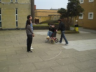
Another main element these trailers showed during the research was action shots which are used to impress the audience, this proved to be a problem for my trailer as it is not realistic for me to have explosions, so money was an issue as these films I had researched from the media world had much bigger budgets than my group (we had no budget). Other problems were lack of skills both from the actors and the production team (my group). For example the films researched all used professional well known actors which would help attract my target audience, but more to the point they are experienced and know how to act, once again the money issue for my group affected us here as we could not afford to hire actors for our trailer. This could affect our diegesis as the lack of acting skills could take the seriousness away from our genre thriller and the film may become less thrilling resulting in not attracting our chosen target audience. As mentioned before lack of skills with our production team, this can include handling the camera or managing the light levels. This was shown within our trailer when the opening first shot is shown of the main protagonists; this shot is a rotating shot where the camera revolves around them in the courtyard.

 The title was created using the same codes and conventions; this includes using the colour red, and the size and font used. The next aspect of my magazine was the price, date and issue. Throughout my research these elements were presented in the smallest font on the page in the dip of the “M”, I did this to follow the codes and conventions of the Empire magazines but also so my target audience know where to find it in its regular place, the font size is small so that the audience may not notice it as it is the least important element on my magazine page. I want the price to be the last thing they look at; they need to firstly be attracted by my other aspects such as the title and images.
As I mentioned in my research Empire tend to use a dull dark background with no particular meaning or location to help the main image stand out. I decided to follow this rule within the Empire magazine by using a background of grey and black clouds which I took during the filming day.

This will allow me to create the same effect as the Empire magazines I have researched. My main image on the page is of the main protagonist Shawn (Actor: Ben). During the pre-production stage of my magazine construction I had narrowed down my ideas to some suitable ideas taken from different angles. I had a shot of him from the side, a shot zoomed out, and a shot zoomed in. However following media codes and conventions I chose a shot which made Ben look dominant and which would take a large proportion of the page up to catch the audience’s attention. This shot shows his dominance by looking up at him however also close up with his head towards the top of the page so his eyes are near the title which will make the audience want to look at his face and then the title helping promote my magazine and film.
 From research I have also noticed that some of the main images used on Empire Magazines over lap the title “Empire” slightly to give it effect and show the importance of the main image. I decided to follow this convention and so I made my image over lap the title slightly. The next element I included on my page was the barcode which initially helped my magazine diegesis making it look like a magazine but also because magazines must have a barcode to sell the item in a shop. From research the magazines all had barcodes but predominantly they were featured at the bottom right of magazine so this is where I located mine.
Within one of my examples of Empire magazine in research but also generally in a lot of their magazines they have the tag line “THE WORLD’S BIGGEST MOVIE MAGAZINE” located in a familiar position under the title in a smaller font to the left. I have decided to include this in my magazine because it will help promote my magazine to help sell it so more people will buy it and read about the main article (my trailer). Also included on all the magazines I researched was the website address located under the title in a smaller font to the right of magazine. This is useful to include on a magazine as it unlocks a whole new media industry (the internet) and allows my target audience to access my articles and information online.
The articles on my magazine front cover are the next elements which need evaluating. They follow the codes and conventions of the articles which I have researched from previous Empire magazines. They are coloured black and white alternatively firstly to determine when a new article starts and secondly so they do not stand out to much. The main focus essentially must lie with the title and main image. These two elements are the key that must grab the attention of my target audience. This is also why I have followed the codes and conventions from my research of not allowing the articles to overlap the main image. It is very important they do not take the attention off the image. My articles are all made up but are like the real articles from Empire magazines which are short, exciting and seem interesting for example “George Lucas The New Idea”.
 Overall my codes and conventions focus on Empire magazine and I believe my magazine is a successful construction allowing my target audience to recognise this well known company and hopefully the diegesis that I have created would fool my audience into thinking it is an official copy.
The radio advertisement was the most difficult element of the coursework for me to complete as I have had no experience making one, unlike magazines trailers and websites I do not listen to radio advertisements. Everything I did within this aspect of the coursework was new to me. As with all products I have created within my media coursework research was one first stage for me to complete so I gain a more in-depth understanding for the codes and conventions of the radio industry. My group researched into a radio case study called “Tell No One”. From this I learned a lot, including the key features involved in a radio advertisement not forgetting the codes and conventions. My group and I then attempted to create a draft script including codes and conventions of a thriller. We decided that creating a riddle spoken in a serious gloomy voice would suit our radio production. When we had completed to pre-production work we booked the recording studio and arranged a suitable time with our actors. So far a conventional approach was taken within our radio advertisement using dialogue and a riddle for a thriller convention to attract our target audience. We also considered heartbeat noses and screams which stereotypically you would expect on a thriller radio advertisement however an experimental approach was taken at this point as we decided not to use these effects in case it sounded fake or cheesy.
Overall within all of my projects we followed a conventional approach which would be recognisable to our target audience, also these conventional approaches show to be successful with hard evidence from other successful films such as Cloverfield.
Combining my four products (trailer, magazine cover, website front page and radio advertisement) is very important in the completion of my objective of marketing a viral campaign. One of my main focuses was to combine my products with recognisable elements so my target audience would recognise my film and make their own likes between my branded products. An example of a combination of our products was the main title of our film “Lost Retribution”, we decided to include the same font and style on our website and trailer so our target audience would recognise it and automatically know what the film is about (genre, actors, narrative). Obviously on the radio advertisement this is not doable however we verbally included the title. This combination was not originally going to be linked due to an idea of following a convention from “Cloverfield” which was to not name the film and leave an enigma, however this is a viral campaign which means advertising the title of the film is very important so we concluded that including the title was appropriate. Another combination which I have considered to be most important is the release date of our product as the opening weekend of a film in the cinema is where it makes the majority of its profit and determines how successful a film is to be; so within the trailer the release date is displayed nearer the end so the audience see it last so they are more likely to remember it and on the website the release date is also displayed in the biggest font with a white colour on black to help it stand out and become recognisable.


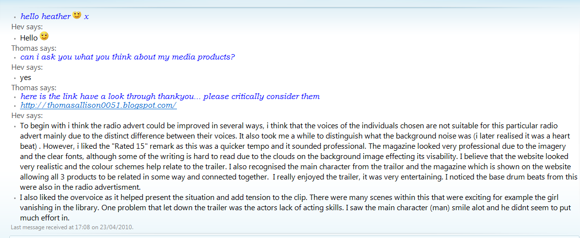
I used a Web2.0 designed piece of software to enable me to develop easy fast responses for my media products and audience feedback. This piece of software is called MSN. This allows me to talk to friends and others online with my own profile. I found three friends that were online at the time and started a conversation asking if they would review my work and critically comment on it. Fortunately they all agreed and gave me some detailed responses which I have print screened for evidence and so I can review their opinions. The three opinions came from Heather, Faye and Yvonne.


Overall I am impressed with the responses however many of them are quite negative. This is a good thing as I can now see where I am going wrong, these three people are also likely to be in my target audience or to be in a relationship with someone who is. Heather gave me a good detail of feedback relating to layouts and colours which she is very knowledgeable about due to studying photography and graphics. All 3 responses given about my radio advert were negative. They all stated that the quality of work provided was of low quality making special reference to the backing heartbeat noise. The second voice was found “funny” which is not what I wanted to convey. However Heather noticed the base drum from the trailer in the trailer which is fantastic as this supports my viral campaign making links between products. Overall the feedback for the radio advertisement was quite negative.
The magazine was found to be my best piece of coursework. The main issue which occurred with all of my audience feedbacks from Faye, Heather and Yvonne noticed the collision of colours from some of articles and the colour of the clouds; this shows me where I can improve for next time. I need to be careful for what colours I include. From the comments gathered I seemed to use a good choice of imagery due to the “dominance” which is shown from the camera angle. Comments which impressed me was the links that were noticed such the main protagonist (Ben) who appeared on 3 out of 4 products and as mentioned before the base drum which is sounded in the trailer and the radio advertisement. These links which have been noticed show that I must have been doing the right thing as my main aim from the beginning was to produce a viral campaign.
The Website on average had mixed opinions. Yvonne commented that the title was “unreadable” which is not good as people might not recognise the name of the film so in future I will use more basic bold fonts. However Yvonne said she was “captured” and drawn in by the different fonts. This is an advantage of my website. Another good thing is that she recognised a link with the trailer due to the tone and mood of both products.
The trailers response on average was good however many comments were made about the “tempo” being too slow for a thriller film. However Yvonne said that I used a good wide range of camera angles which showed my knowledge. The trailer was described by Faye as “enjoyable” and “entertaining”. This is good as it shows that my trailer is drawing in my target audience and it may tempt them to want to go and watch the film. Other positive comments included the authentic use of “CCTV shots” and Yvonne said it had many “memorable” scenes such as the library scene.
Overall I am impressed with the feedback; there was a good range of positive and negative opinions. This is good as it shows were my strengths lie but more importantly it shows me where I need to improve and concentrate on for next time in the future.
The initial construction of producing a viral campaign contains many processes which must be concentrated on when producing this “buzz”. This year is a continuation from last year from experience to my knowledge of the media and what attracts a target audience. This year included many new aspects for me which I have not covered before. For example creating a magazine cover and a radio advertisement is something quite new for me which I have not covered before.
From previous experience during the AS coursework where I had to produce two video clips one of an opening sequence and one following the rule of entering the room and exchanging dialogue, within both I had followed a conventional approach following the codes and conventions of real life media. I achieved this from research. So during the A2 coursework I once again decided to use a conventional approach which would develop similar codes and conventions of real life products.
My reason being that this would be less risky and attracting my target audience would be easier and that they would develop more of an attraction due to following codes and conventions of real life media products. This was done within my project by using stereotypes and situations that are well known to my target audience for example my location of the college.

To understand this conventional approach more me and my group researched into 3 well known case studies of existing media products, these were "Inception", “Inglorious Bastards” and “Cloverfield”. Researching into these film trailers using YouTube I was able to expand my understanding into the codes and conventions of trailers and what the best techniques are to attract my target audience. What I learnt from these trailers was that there is no structure between shots and that in some cases to create an enigma revealing as little as possible is the best way to do so for example in “Cloverfield” the trailer runs through without giving away the narrative or the title of the film which makes the audience (including me) want to know more about the film ensuring that they would go and view it. Examples of me developing a conventional approach is shown through my antagonist, throughout my film trailer the antagonist is not shown at all, we know the presence is there via my use of point of view shots and my main characters running from it however the identity is kept in the dark, this idea came from “Cloverfield” making the audience want to know more, ensuring they will want to come and view the film to find out to solve the enigma which I have used. More conventional codes and conventions are used in general the trailer using a variety of fast moving shots to increase the tempo keeping my target audience attention which these thriller films show.
Another main element these trailers showed during the research was action shots which are used to impress the audience, this proved to be a problem for my trailer as it is not realistic for me to have explosions, so money was an issue as these films I had researched from the media world had much bigger budgets than my group (we had no budget). Other problems were lack of skills both from the actors and the production team (my group). For example the films researched all used professional well known actors which would help attract my target audience, but more to the point they are experienced and know how to act, once again the money issue for my group affected us here as we could not afford to hire actors for our trailer. This could affect our diegesis as the lack of acting skills could take the seriousness away from our genre thriller and the film may become less thrilling resulting in not attracting our chosen target audience. As mentioned before lack of skills with our production team, this can include handling the camera or managing the light levels. This was shown within our trailer when the opening first shot is shown of the main protagonists; this shot is a rotating shot where the camera revolves around them in the courtyard.

This shot took many takes and still the final piece is shaky and unprofessionally a member of our group is shown is the shot as the camera rotates. Another example of developing a conventional approach within our film is the use of dialogue running over the trailer; this idea came from “Inglorious Bastards” which also uses dialogue over the trailer. This effect within our trailer helps give an enigma by asking questions adding emotion to out film clip.

The entire trailer follows a conventional approach from the shots which are shown in real life media clips including angles of the shots for example the courtyard shot shows the main protagonists in a dominant sense as the camera looks up at them. Another conventional approach used during the trailer was simple codes and conventions such as darker light levels to give it a more thrilling effect. An additional conventional approach which we added to our trailer was the effect of noice at the final clip of Becca speaking to help give it a documentry type feeling adding to my diegesis. We had a few problems with light levels as when filming during the evening the light levels dropped so some of our shots were hard to see and in the end we ended up improvising using an blue LED torch to act as moon light. The music once again was a conventional approach, most thrillers use some type of music to create suspense, within my trailer this was also done, my group and I booked out the sound room within the media department at Weymouth College in order to create our own sound, we came up with a drone which builds up throughout the trailer adding to the thriller genre diegesis creating tension helping attract our target audience. Two main conventional approaches which are used by professional media institutions that I have used to add to my diegesis are the 180 degree rule and the rule of thirds, which help me to align my actors to show dominance and power and to stop confusion during shots and conversations. Overall my trailer predominantly focuses of conventional approaches to attracting the target audience as it is seen as “safer” to follow a used approach to help gain popularity.
Once again I have attempted to follow a conventional approach to my website front page. I began by researching into different websites. As seen on my blog before focusing on the website I had already done some basic research into Web 2.0 design which gave me a gist to what a website is used for and what is found within a website. The next stage of research began into 5 different film websites with no particular genre this enabled me to determine differences between genres and once again focus on similarities between them. Examples of websites I looked at were Indiana Jones 5 which has an action adventure film and Harry Potter which has a thriller theme. My detailed research began later which focused on three main websites all with the thriller genre so I could expand my knowledge and it would so enable me to begin creating my website. The websites I researched into were “SAW5”, “Hostel2” and “The Dark Knight”.


From these I gathered similar codes and conventions which would help me develop a conventional approach. Some of these conventional approaches which I have used are the dark colour schemes, all my research showed black or dark grey colour schemes, I have followed this approach by using a black background and outer edge which fades from my central main image. Other similarities on these front pages included a main image which relates to the film, I followed the batman idea which was to have the main image as the location. For example the batman background is the camera looking up at sky scrapers showing where the film is set; this image is also dark and gloomy with the camera looking up at it showing dominance.

This conventional approach was used in my website front page as I got a shot of the main college building at night when it was lit up with the lower part of the image being the hedge around the edge of the college. The camera is slightly point upwards giving it the same effect with the dark colour scheme adding to my website diegesis. My title is presented small at the top left of the page once again following a conventional approach with the release date presented in the centre of the page in a white font so it stands out. It is also the biggest font on the page due to it being the most important element on the page because the purpose of the website is to help promote the film and so making sure our target audience see the release date will enable people to go and view the film. I also decided to include the image of male protagonist on the right of the page sized quite large so people will recognise him from the magazine cover and from the trailer. This idea came from the Harry Potter website as Harry Potter and two other characters are positioned on the website on top of the clouds so the target audience will recognise them as Harry Potter characters. However I have made my image slightly transparent to give him a ghost effect showing my thriller genre. Other conventional approaches which I have followed include the credits located at the bottom on the page using the same small fonts as my researched websites. Also I have included the age rating for my film for legal reasons to inform viewers what the age is to view the film.

I had also included a quote which is said in the dialogue on the film. I added this as a conventional aspect as a website I have research previously had quotes from the film included. Overall my Website follows a conventional approach following codes and conventions of the thriller aspect.
After researching into magazines I decided to base my magazine construction on “Empire Magazines”. I completed detail research into Empire and Sight And Sound. I concluded that I would follow a conventional approach and follow the same codes and conventions of Empire.


To begin with starting at the top of the page with the main title “Empire” I replicated the title used by the official Empire Magazine company to ensure my target audience understand what I am representing. This title is located central at the top of the page at the same size as the example magazines I have used in my research to ensure that my target audience recognise the style of magazine helping give it shelf impact. My title should be the first recognisable image on my constructed magazine cover to give away its genre and purpose.
Once again I have attempted to follow a conventional approach to my website front page. I began by researching into different websites. As seen on my blog before focusing on the website I had already done some basic research into Web 2.0 design which gave me a gist to what a website is used for and what is found within a website. The next stage of research began into 5 different film websites with no particular genre this enabled me to determine differences between genres and once again focus on similarities between them. Examples of websites I looked at were Indiana Jones 5 which has an action adventure film and Harry Potter which has a thriller theme. My detailed research began later which focused on three main websites all with the thriller genre so I could expand my knowledge and it would so enable me to begin creating my website. The websites I researched into were “SAW5”, “Hostel2” and “The Dark Knight”.
From these I gathered similar codes and conventions which would help me develop a conventional approach. Some of these conventional approaches which I have used are the dark colour schemes, all my research showed black or dark grey colour schemes, I have followed this approach by using a black background and outer edge which fades from my central main image. Other similarities on these front pages included a main image which relates to the film, I followed the batman idea which was to have the main image as the location. For example the batman background is the camera looking up at sky scrapers showing where the film is set; this image is also dark and gloomy with the camera looking up at it showing dominance.

This conventional approach was used in my website front page as I got a shot of the main college building at night when it was lit up with the lower part of the image being the hedge around the edge of the college. The camera is slightly point upwards giving it the same effect with the dark colour scheme adding to my website diegesis. My title is presented small at the top left of the page once again following a conventional approach with the release date presented in the centre of the page in a white font so it stands out. It is also the biggest font on the page due to it being the most important element on the page because the purpose of the website is to help promote the film and so making sure our target audience see the release date will enable people to go and view the film. I also decided to include the image of male protagonist on the right of the page sized quite large so people will recognise him from the magazine cover and from the trailer. This idea came from the Harry Potter website as Harry Potter and two other characters are positioned on the website on top of the clouds so the target audience will recognise them as Harry Potter characters. However I have made my image slightly transparent to give him a ghost effect showing my thriller genre. Other conventional approaches which I have followed include the credits located at the bottom on the page using the same small fonts as my researched websites. Also I have included the age rating for my film for legal reasons to inform viewers what the age is to view the film.

I had also included a quote which is said in the dialogue on the film. I added this as a conventional aspect as a website I have research previously had quotes from the film included. Overall my Website follows a conventional approach following codes and conventions of the thriller aspect.
After researching into magazines I decided to base my magazine construction on “Empire Magazines”. I completed detail research into Empire and Sight And Sound. I concluded that I would follow a conventional approach and follow the same codes and conventions of Empire.


To begin with starting at the top of the page with the main title “Empire” I replicated the title used by the official Empire Magazine company to ensure my target audience understand what I am representing. This title is located central at the top of the page at the same size as the example magazines I have used in my research to ensure that my target audience recognise the style of magazine helping give it shelf impact. My title should be the first recognisable image on my constructed magazine cover to give away its genre and purpose.
 The title was created using the same codes and conventions; this includes using the colour red, and the size and font used. The next aspect of my magazine was the price, date and issue. Throughout my research these elements were presented in the smallest font on the page in the dip of the “M”, I did this to follow the codes and conventions of the Empire magazines but also so my target audience know where to find it in its regular place, the font size is small so that the audience may not notice it as it is the least important element on my magazine page. I want the price to be the last thing they look at; they need to firstly be attracted by my other aspects such as the title and images.
As I mentioned in my research Empire tend to use a dull dark background with no particular meaning or location to help the main image stand out. I decided to follow this rule within the Empire magazine by using a background of grey and black clouds which I took during the filming day.

This will allow me to create the same effect as the Empire magazines I have researched. My main image on the page is of the main protagonist Shawn (Actor: Ben). During the pre-production stage of my magazine construction I had narrowed down my ideas to some suitable ideas taken from different angles. I had a shot of him from the side, a shot zoomed out, and a shot zoomed in. However following media codes and conventions I chose a shot which made Ben look dominant and which would take a large proportion of the page up to catch the audience’s attention. This shot shows his dominance by looking up at him however also close up with his head towards the top of the page so his eyes are near the title which will make the audience want to look at his face and then the title helping promote my magazine and film.
 From research I have also noticed that some of the main images used on Empire Magazines over lap the title “Empire” slightly to give it effect and show the importance of the main image. I decided to follow this convention and so I made my image over lap the title slightly. The next element I included on my page was the barcode which initially helped my magazine diegesis making it look like a magazine but also because magazines must have a barcode to sell the item in a shop. From research the magazines all had barcodes but predominantly they were featured at the bottom right of magazine so this is where I located mine.
Within one of my examples of Empire magazine in research but also generally in a lot of their magazines they have the tag line “THE WORLD’S BIGGEST MOVIE MAGAZINE” located in a familiar position under the title in a smaller font to the left. I have decided to include this in my magazine because it will help promote my magazine to help sell it so more people will buy it and read about the main article (my trailer). Also included on all the magazines I researched was the website address located under the title in a smaller font to the right of magazine. This is useful to include on a magazine as it unlocks a whole new media industry (the internet) and allows my target audience to access my articles and information online.
The articles on my magazine front cover are the next elements which need evaluating. They follow the codes and conventions of the articles which I have researched from previous Empire magazines. They are coloured black and white alternatively firstly to determine when a new article starts and secondly so they do not stand out to much. The main focus essentially must lie with the title and main image. These two elements are the key that must grab the attention of my target audience. This is also why I have followed the codes and conventions from my research of not allowing the articles to overlap the main image. It is very important they do not take the attention off the image. My articles are all made up but are like the real articles from Empire magazines which are short, exciting and seem interesting for example “George Lucas The New Idea”.
 Overall my codes and conventions focus on Empire magazine and I believe my magazine is a successful construction allowing my target audience to recognise this well known company and hopefully the diegesis that I have created would fool my audience into thinking it is an official copy.
The radio advertisement was the most difficult element of the coursework for me to complete as I have had no experience making one, unlike magazines trailers and websites I do not listen to radio advertisements. Everything I did within this aspect of the coursework was new to me. As with all products I have created within my media coursework research was one first stage for me to complete so I gain a more in-depth understanding for the codes and conventions of the radio industry. My group researched into a radio case study called “Tell No One”. From this I learned a lot, including the key features involved in a radio advertisement not forgetting the codes and conventions. My group and I then attempted to create a draft script including codes and conventions of a thriller. We decided that creating a riddle spoken in a serious gloomy voice would suit our radio production. When we had completed to pre-production work we booked the recording studio and arranged a suitable time with our actors. So far a conventional approach was taken within our radio advertisement using dialogue and a riddle for a thriller convention to attract our target audience. We also considered heartbeat noses and screams which stereotypically you would expect on a thriller radio advertisement however an experimental approach was taken at this point as we decided not to use these effects in case it sounded fake or cheesy.
Overall within all of my projects we followed a conventional approach which would be recognisable to our target audience, also these conventional approaches show to be successful with hard evidence from other successful films such as Cloverfield.
Combining my four products (trailer, magazine cover, website front page and radio advertisement) is very important in the completion of my objective of marketing a viral campaign. One of my main focuses was to combine my products with recognisable elements so my target audience would recognise my film and make their own likes between my branded products. An example of a combination of our products was the main title of our film “Lost Retribution”, we decided to include the same font and style on our website and trailer so our target audience would recognise it and automatically know what the film is about (genre, actors, narrative). Obviously on the radio advertisement this is not doable however we verbally included the title. This combination was not originally going to be linked due to an idea of following a convention from “Cloverfield” which was to not name the film and leave an enigma, however this is a viral campaign which means advertising the title of the film is very important so we concluded that including the title was appropriate. Another combination which I have considered to be most important is the release date of our product as the opening weekend of a film in the cinema is where it makes the majority of its profit and determines how successful a film is to be; so within the trailer the release date is displayed nearer the end so the audience see it last so they are more likely to remember it and on the website the release date is also displayed in the biggest font with a white colour on black to help it stand out and become recognisable.


This idea of linking my products synergistically is an advantage for my group and I as it gives us a better chance of promoting our film to different audiences for example those who use the internet or those who listen to the radio or even watch television. Another example of linking my products is between the trailer and the website as we decided using an over voice speech on top of the trailer would help give our film emotion and give an explanation to the truth within the film. On one of my individual projects (website) I decided to include one of the script lines from the film and put it on the image on my website so my target audience could relate to the film and recognise it “Some truths are better left in the dark...” Overall there are many combinations that I have used to link my products which will give my product an advantage in the marketing stage and hopefully increase its popularity helping it become a successful film.
New media technologies are one of the fastest developing elements within the media industry. To this day everyone with a computer now has the ability to be a producer themselves and create low budgeted home films. Not only producing the film but new media technologies also allow people to exhibit their films to a live audience using YouTube.

To begin with chronologically the research stage for the first progression undertook by my group. New media technologies were vital within this stage as the majority of my research and my groups research took place on the internet. This involved media websites, film websites, Youtube for viewing trailers. Web2.0 played a very important role at the researching stage of my coursework as viewing trailers was very important for case study material. Other Web2.0 design websites were used at the research into film websites, for example Indiana Jones used Web2.0 design to allow their audience to sign up for news information and ad ons from the film. New media technologies were also involved at the pre-production stage of my coursework as the use of computers became vital for our layouts and format of our work. We used two main elements on the internet so our group could link together, share items and present our work electronically in a professional format. These websites were formatted using Web2.0 design allowing us to create our own accounts and blogs (www.blogger.com), we were able to have our own storage for our pre-production and link it to our blogger where are work is laid out (www.google.com/documents). I used word for presenting my conclusions and ideas, images were also inserted to help explain my workings. These images were taken by me during the production stage of the product to help explain my ideas; I took them using a digital camera (owned by me). This is another example of me using New Media Technologies in the process of my media coursework. I was then able to use a USB cable to transfer them on to my computer.
New Media Technologies (NMT) was heavily involved during the production stage of my coursework when producing and filming our products. When filming our trailer using our final storyboards we used a camera with widescreen format. This is another example of using New Media Technologies. More evidence which is shown via my print screens is the use of photo shop which is a type of NMT I used to edit my images for my website and magazine. I was able to create fonts, merge photos, cut out photos and I created my final magazine front cover using this program. Another example of NMT was Dreamweaver which helped me design my website; I had practice on these two programs during some of my lessons in preparation for my coursework. The Main NMT which I have used was Adobe Premiere. This is more advanced than Windows Movie Maker which I used for my AS project. I had some practice using this before editing my coursework. This software is very useful and gave me more freedom with what I could do with my footage.

Overall I used a lot of new media technologies and without them my work would be less successful and would not have the professional outlook. My skills using these New Media Technologies has defiantly improved and I have a lot of knowledge about using these programs to benefit my coursework.
New media technologies are one of the fastest developing elements within the media industry. To this day everyone with a computer now has the ability to be a producer themselves and create low budgeted home films. Not only producing the film but new media technologies also allow people to exhibit their films to a live audience using YouTube.
To begin with chronologically the research stage for the first progression undertook by my group. New media technologies were vital within this stage as the majority of my research and my groups research took place on the internet. This involved media websites, film websites, Youtube for viewing trailers. Web2.0 played a very important role at the researching stage of my coursework as viewing trailers was very important for case study material. Other Web2.0 design websites were used at the research into film websites, for example Indiana Jones used Web2.0 design to allow their audience to sign up for news information and ad ons from the film. New media technologies were also involved at the pre-production stage of my coursework as the use of computers became vital for our layouts and format of our work. We used two main elements on the internet so our group could link together, share items and present our work electronically in a professional format. These websites were formatted using Web2.0 design allowing us to create our own accounts and blogs (www.blogger.com), we were able to have our own storage for our pre-production and link it to our blogger where are work is laid out (www.google.com/documents). I used word for presenting my conclusions and ideas, images were also inserted to help explain my workings. These images were taken by me during the production stage of the product to help explain my ideas; I took them using a digital camera (owned by me). This is another example of me using New Media Technologies in the process of my media coursework. I was then able to use a USB cable to transfer them on to my computer.
New Media Technologies (NMT) was heavily involved during the production stage of my coursework when producing and filming our products. When filming our trailer using our final storyboards we used a camera with widescreen format. This is another example of using New Media Technologies. More evidence which is shown via my print screens is the use of photo shop which is a type of NMT I used to edit my images for my website and magazine. I was able to create fonts, merge photos, cut out photos and I created my final magazine front cover using this program. Another example of NMT was Dreamweaver which helped me design my website; I had practice on these two programs during some of my lessons in preparation for my coursework. The Main NMT which I have used was Adobe Premiere. This is more advanced than Windows Movie Maker which I used for my AS project. I had some practice using this before editing my coursework. This software is very useful and gave me more freedom with what I could do with my footage.

Overall I used a lot of new media technologies and without them my work would be less successful and would not have the professional outlook. My skills using these New Media Technologies has defiantly improved and I have a lot of knowledge about using these programs to benefit my coursework.
AUDIENCE FEEDBACK
I used a Web2.0 designed piece of software to enable me to develop easy fast responses for my media products and audience feedback. This piece of software is called MSN. This allows me to talk to friends and others online with my own profile. I found three friends that were online at the time and started a conversation asking if they would review my work and critically comment on it. Fortunately they all agreed and gave me some detailed responses which I have print screened for evidence and so I can review their opinions. The three opinions came from Heather, Faye and Yvonne.


Overall I am impressed with the responses however many of them are quite negative. This is a good thing as I can now see where I am going wrong, these three people are also likely to be in my target audience or to be in a relationship with someone who is. Heather gave me a good detail of feedback relating to layouts and colours which she is very knowledgeable about due to studying photography and graphics. All 3 responses given about my radio advert were negative. They all stated that the quality of work provided was of low quality making special reference to the backing heartbeat noise. The second voice was found “funny” which is not what I wanted to convey. However Heather noticed the base drum from the trailer in the trailer which is fantastic as this supports my viral campaign making links between products. Overall the feedback for the radio advertisement was quite negative.
The magazine was found to be my best piece of coursework. The main issue which occurred with all of my audience feedbacks from Faye, Heather and Yvonne noticed the collision of colours from some of articles and the colour of the clouds; this shows me where I can improve for next time. I need to be careful for what colours I include. From the comments gathered I seemed to use a good choice of imagery due to the “dominance” which is shown from the camera angle. Comments which impressed me was the links that were noticed such the main protagonist (Ben) who appeared on 3 out of 4 products and as mentioned before the base drum which is sounded in the trailer and the radio advertisement. These links which have been noticed show that I must have been doing the right thing as my main aim from the beginning was to produce a viral campaign.
The Website on average had mixed opinions. Yvonne commented that the title was “unreadable” which is not good as people might not recognise the name of the film so in future I will use more basic bold fonts. However Yvonne said she was “captured” and drawn in by the different fonts. This is an advantage of my website. Another good thing is that she recognised a link with the trailer due to the tone and mood of both products.
The trailers response on average was good however many comments were made about the “tempo” being too slow for a thriller film. However Yvonne said that I used a good wide range of camera angles which showed my knowledge. The trailer was described by Faye as “enjoyable” and “entertaining”. This is good as it shows that my trailer is drawing in my target audience and it may tempt them to want to go and watch the film. Other positive comments included the authentic use of “CCTV shots” and Yvonne said it had many “memorable” scenes such as the library scene.
Overall I am impressed with the feedback; there was a good range of positive and negative opinions. This is good as it shows were my strengths lie but more importantly it shows me where I need to improve and concentrate on for next time in the future.
Sunday, 28 March 2010
Magazine Production Progress Report
Thomas Allison 0051

My magazine production kicked off by gathering my chosen photos from pre-production and ideas and putting them on my memory stick ready to use PhotoShop at college. It was at this stage that I realised that the photoshop practice lessons paid off (http://thomasallison0051.blogspot.com/2009/11/photoshop-practice-for-magazine-covers.html). This saved me alot of time as I am now already familiar with the PhotoShop program so I could began to put my ideas together.
I uploaded my photos and fonts and other elements such as the barcode and began to produce my constructed magazine cover. Firstly I had to set the page requirements to the A4 sizes so the picture would fit a proper sized magazine cover without getting pixilated if i had to enlarge it from a smaller page.
The next stage was to upload my background (dark clouds) and set it as my first layer so it is my base for my work so i could start adding my other elements of my diegesis. The magic wand tool was the most usful tool for me when cutting my photos out to stick on my website. However i did encounter a problem when trying to cut out my protagonists hair and so i had to use the manual whilst zoomed in to deal with this.
That was the only problem with photoshop that I had due to the practice I have had. However PhotoShop is a complex program with all the different tools and layers for it was a long process of approximatly 3 lessons. However the final piece looks very successful and protrays EMPIRE magazines professional due to my constructed diegesis.
Target Audience For My Magazine
Thomas Allison 0051
Before Constructing my magazine it is important to identify my target audience and list possible qualities which will aid my promotion of my trailer to get them to buy it.
To begin with my target audience is going to quite like my film trailer audience in the sense that they are the people who will be interested in my trailer and would follow these codes and conventions of my thriller choice.
My target audience is likely to be on average 18 year old males who have finished or are coming to the end of their education. They are most likely to be Atheist or only have a weak belief in religion so they can have an understanding in my thriller and almost believe that these sort of conventions are real. My target audience are also likely to be British as the codes and conventions of my trailer are well recognised in Britian but also because my actors are English and the location we filmed at is also English.
The hobbies and interests of my chosen audience are likely to be Empire Film subscribers, regular cinema visitors and love the thriller genre; so their favourite films are likely to be Saw 5 and The Grudge. They are also likely to own X-Boxs and play games like Hallo or Call Of Duty. If they drive they are likely to listen to Absolute Radio and their main gossip at college would be on the topic of Triller or film. These people are also likely to be up to date with fashion and the latest gossips within film, they will know about celebrities and will likely have a favorite football team.
Each of these micro-elements help me to make decisions on what to include on my magazine to effectively attract my target audience. For example to include a review about Saw 5 would help as they would want to read into this as their favorite type of film is Thrillers. My target audience will relate to my magazine cover by the recognisable logo "Empire" and the main article of my protagonist.

They will should already be able to identify with it as they may have seen the trailer, website or even heard the radio advertisment. The codes and coventions of my magazine will help my audience identify with it such as the dark grey background using colour codes of a thriller showing its genre (thriller). All these key elements add up to the diegesis of my magazine with similar traits to the audience to get them to buy it promoting my film trailer; for example the protagonist is on the front cover at the age of 19 he relates to my target audience so they will relate to him.
Friday, 26 March 2010
UK Legal Frameworks For Magazines
Thomas Allison 0051
Before beginning to plan my magazine or even research into other types of magazines my main focus was to research into the UK legal framework for magazines which was put forward by CAP. The main rules that may interfere with me creating a magazine are:
• ‘Marketing communications must conform with the Code. Primary responsibility for observing the Code falls on marketers...’.
• ‘All marketing communications should be legal, decent, honest and truthful.’
• ‘All marketing communications should be prepared with a sense of responsibility to consumers and to society.’
• No marketing communication should mislead, or be likely to mislead, by inaccuracy, ambiguity, exaggeration, omission or otherwise.
• Marketers should not exploit the credulity, lack of knowledge or inexperience of consumers.
• Marketing communications should contain nothing that condones or is likely to provoke violence or anti-social behaviour.
• No marketing communication should cause fear or distress without good reason. Marketers should not use shocking claims or images merely to attract attention.
• Marketing communications should contain nothing that is likely to cause serious or widespread offence. Particular care should be taken to avoid causing offence on the grounds of race, religion, sex, sexual orientation or disability. Compliance with the Code will be judged on the context, medium, audience, product and prevailing standards of decency.
• Marketing communications may be distasteful without necessarily conflicting with 5.1 above. Marketers are urged to consider public sensitivities before using potentially offensive material.
• ‘Publishers announcing reader promotions on the front page or cover should ensure that consumers know whether they will be expected to buy subsequent editions of the publication. Major conditions that might reasonably influence consumers significantly in their decision to buy the publication should appear on the front page or cover.’
• ‘A recommended retail price (RRP), or similar, used as a basis of comparison should be genuine; it should not differ significantly from the price at which the product is generally sold.’
I must consider all the above, this involves being decent and truthful showing no offence. I must also take responsibility for my actions and my consumers. My magazine is a movie magazine front cover and will show no racism or sexual activity or any offence of any kind. The last 2 bullet points refer to magazine front covers especially which is what I am focusing on and therefore I must obey and not exceed the rules. The first bullet points refers to add ons and collectable items within magazines which must be expressed on the front page however this does not refer to me as this magazine is a one off and only refers to my film. The second bullet point refers to the price which must be displayed on the front. I must consider this when constructing my magazine.
Now I know the legal requirements I can now begin researching and begin to construct my magazine.
Evaluation Of My Constructed Magazine

Now my construction is complete it is time to begin the evaluation process of my product. To begin with starting at the top of the page with the main title “Empire” I replicated the title used by the official Empire Magazine company to ensure my target audience understand what I am representing. This title is located central at the top of the page at the same size as the example magazines I have used in my research to ensure that my target audience recognise the style of magazine helping give it shelf impact. My title should be the first recognisable image on my constructed magazine cover to give away its genre and purpose. The title was created using the same codes and conventions; this includes using the colour red, and the size and font used. The next aspect of my magazine was the price, date and issue. Throughout my research these elements were presented in the smallest font on the page in the dip of the “M”, I did this to follow the codes and conventions of the Empire magazines but also so my target audience know where to find it in its regular place, the font size is small so that the audience may not notice it as it is the least important element on my magazine page. I want the price to be the last thing they look at; they need to firstly be attracted by my other aspects such as the title and images.
As I mentioned in my research Empire tend to use a dull dark background with no particular meaning or location to help the main image stand out. I decided to follow this rule within the Empire magazine by using a background of grey and black clouds which I took during the filming day. This will allow me to create the same effect as the Empire magazines I have researched.

My main image on the page is of the main protagonist Shawn (Actor: Ben). During the pre-production stage of my magazine construction I had narrowed down my ideas to some suitable ideas taken from different angles. I had a shot of him from the side, a shot zoomed out, and a shot zoomed in. However following media codes and conventions I chose a shot which made Ben look dominant and which would take a large proportion of the page up to catch the audience’s attention. This shot shows his dominance by looking up at him however also close up with his head towards the top of the page so his eyes are near the title which will make the audience want to look at his face and then the title helping promote my magazine and film. From research I have also noticed that some of the main images used on Empire Magazines over lap the title “Empire” slightly to give it effect and show the importance of the main image. I decided to follow this convention and so I made my image over lap the title slightly.
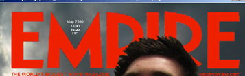
The next element I included on my page was the barcode which initially helped my magazine diegesis making it look like a magazine but also because magazines must have a barcode to sell the item in a shop. From research the magazines all had bar codes but predominantly they were featured at the bottom right of magazine so this is where I located mine.
Within one of my examples of Empire magazine in research but also generally in a lot of their magazines they have the tag line “THE WORLD’S BIGGEST MOVIE MAGAZINE” located in a familiar position under the title in a smaller font to the left. I have decided to include this in my magazine because it will help promote my magazine to help sell it so more people will buy it and read about the main article (my trailer). Also included on all the magazines I researched was the website address located under the title in a smaller font to the right of magazine. This is useful to include on a magazine as it unlocks a whole new media industry (the internet) and allows my target audience to access my articles and information online.
The articles on my magazine front cover are the next elements which need evaluating. They follow the codes and conventions of the articles which I have researched from previous Empire magazines. They are coloured black and white alternatively firstly to determine when a new article starts and secondly so they do not stand out to much.

The main focus essentially must lie with the title and main image. These two elements are the key that must grab the attention of my target audience. This is also why I have followed the codes and conventions from my research of not allowing the articles to overlap the main image. It is very important they do not take the attention off the image. My articles are all made up but are like the real articles from Empire magazines which are short, exciting and seem interesting for example “George Lucas The New Idea”.
Overall my codes and conventions focus on Empire magazine and I believe my magazine is a successful construction allowing my target audience to recognise this well known company and hopefully the diegesis that I have created would fool my audience into thinking it is an official copy.
Magazine Pre Production Progress Report
Thomas Allison 0051
My Magazine Pre Production went fairly well and there were not many problems with designing my magazine. To begin with Research was found to be interesting and the comparison of different film magazine companies and the magazines within the companies used fairly similar methods to attract their target audiences. These included using the same Titles and methods of presenting their pictures. From the research i then determined my chosen magazine company to represent, I chose Empire as they focus more main stream and I have taken more of a interest in their magazines rather than Sight and Sound After research was completed and when I had more of an understanding about the magazine media industry I began to plan ideas drawing sketches and analysing my ideas. The next stage came when filming the trailer. I took as many photos as possible to enable me to chose from a large range to either be the background or main image on my magazine. I narrowed my options down and then began to write about them stating why they were usable or effective in attracting my target audience. My chosen Ideas were the grey clouds in the sky following Empires codes and Conventions and my main image was the protagonist (Ben) posing a dominant stance with his eyes facing towards the top to get the audiences attention near to the main logo. After I had gathered my main images and backgrounds (which includes possible fonts, barcode, Main title and price) it was time to use PhotoShop to begin the construction of my magazine.
My Magazine Pre Production went fairly well and there were not many problems with designing my magazine. To begin with Research was found to be interesting and the comparison of different film magazine companies and the magazines within the companies used fairly similar methods to attract their target audiences. These included using the same Titles and methods of presenting their pictures. From the research i then determined my chosen magazine company to represent, I chose Empire as they focus more main stream and I have taken more of a interest in their magazines rather than Sight and Sound After research was completed and when I had more of an understanding about the magazine media industry I began to plan ideas drawing sketches and analysing my ideas. The next stage came when filming the trailer. I took as many photos as possible to enable me to chose from a large range to either be the background or main image on my magazine. I narrowed my options down and then began to write about them stating why they were usable or effective in attracting my target audience. My chosen Ideas were the grey clouds in the sky following Empires codes and Conventions and my main image was the protagonist (Ben) posing a dominant stance with his eyes facing towards the top to get the audiences attention near to the main logo. After I had gathered my main images and backgrounds (which includes possible fonts, barcode, Main title and price) it was time to use PhotoShop to begin the construction of my magazine.
Thursday, 25 March 2010
Evaluating my Coursework (Progress Reports)
Thomas Allison 0051
Main Evaluation
General
Link to Challenging Aspects Of My As Coursework
Link to Creative Development through Digital Technology
Link to Creative Development
Link to Creative Development Part 2
Link to Programs Used
Film
Link to Pre Production Part 1
Link to Pre Production Part 2
Link to Pre Production Part 3
Link to Production
Link to Sound Recording
Link to Editing
Magazine
Link to Pre Production
Link to Production
Website
Link to Pre Production
Link to Production
Radio
Link to Pre Production
Link to Production
Link to Editing
Advertising Industry Codes Of Practice For Radio
Thomas Allison 0051
Rowan Smith 0121
Samantha Grant 0081
In the same way that we needed to consider the Advertising Industry Codes of Practice for our trailer, we also need to consider these for our radio advert.
Reactions to different adverts can be vastly different , and so each station has to take into account different adverts, and make responsible judgements to make sure all the sensitive areas have been considered when choosing which adverts to broadcast. Research shows that a significant number of listeners, such as under 16 year olds, will be listening at certain times, for example in the mornings or school holidays. We will need to take all of the regulations into consideration when creating our radio advert.
With reference to ‘Good taste, decency and offence to public feeling’ on the BCAP Radio Advertising Code, we will need to consider:
a) offensive and profane language must be avoided;
b) salacious, violent or indecent themes, or sexual innuendo or stereotyping likely to cause serious or general offence, should be avoided;
c) the handling of films, plays, music tracks or websites with salacious, violent or sexual themes and/or titles requires careful consideration. Audio clips should portray the product’s true nature but clips containing bad language, sexual innuendo and/or gratuitous violence should normally be avoided;
In order to abide by these rules, we will make sure that any dialogue we use from our film will be suitable, for example no swearing, and we will choose scenes that do not include violence or sexual innuendo.
‘Advertising must not harm listeners nor exploit, either personally or financially, their vulnerability. No advertising is acceptable from those who practise or advocate illegal or harmful, or potentially harmful behaviour. No advertisement may encourage or condone behaviour which is harmful or prejudicial to health and safety. This does not preclude responsible advertisements for products and services which, used to excess or abused, could endanger health or safety.’ This is another rule that we will need to observe when creating our radio advert. In order to do this, any content we will use from our film will not include violence or behaviour that jeopardises health and safety.
‘Advertisements must not exploit the superstitious and must not, without justifiable reason, play on fear. A ‘justifiable reason’, for example, would be where the aim of the advertisement was to influence listeners to take action to improve safety or welfare. An impression of a person under threat from fire or a car accident could be acceptable, for example, if their function was to persuade listeners respectively to fit smoke alarms in their homes or to wear seat belts.’ Although the genre of our film is a thriller, in order to not play on fear, we will make sure we don’t use any scenes that portray this within our radio advert.
‘Advertisements must not include sounds likely to create a safety hazard. Distracting or potentially alarming sound effects such as sirens, horns, screeching tyres, vehicle collisions and the like must be treated cautiously; they may be dangerous to those listening, especially whilst driving. In particular, they should avoid being featured at the start of advertisements, before listeners are clear about what they are listening to.’ This rule is particularly important for us to consider when we create the radio advert for our film. Because the radio advert will be listened to when people are in their cars, we have to consider the fact that any sudden noises or screaming etc could affect the health and safety of listeners. In order to abide by this, we will aim to avoid using any noises such as this, but any noises we do use will not be at the beginning of our advert, and will be slightly muted in order to make them quieter.
Subscribe to:
Posts (Atom)
