
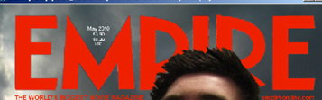
Now my construction is complete it is time to begin the evaluation process of my product. To begin with starting at the top of the page with the main title “Empire” I replicated the title used by the official Empire Magazine company to ensure my target audience understand what I am representing. This title is located central at the top of the page at the same size as the example magazines I have used in my research to ensure that my target audience recognise the style of magazine helping give it shelf impact. My title should be the first recognisable image on my constructed magazine cover to give away its genre and purpose. The title was created using the same codes and conventions; this includes using the colour red, and the size and font used. The next aspect of my magazine was the price, date and issue. Throughout my research these elements were presented in the smallest font on the page in the dip of the “M”, I did this to follow the codes and conventions of the Empire magazines but also so my target audience know where to find it in its regular place, the font size is small so that the audience may not notice it as it is the least important element on my magazine page. I want the price to be the last thing they look at; they need to firstly be attracted by my other aspects such as the title and images.
As I mentioned in my research Empire tend to use a dull dark background with no particular meaning or location to help the main image stand out. I decided to follow this rule within the Empire magazine by using a background of grey and black clouds which I took during the filming day. This will allow me to create the same effect as the Empire magazines I have researched.

The next element I included on my page was the barcode which initially helped my magazine diegesis making it look like a magazine but also because magazines must have a barcode to sell the item in a shop. From research the magazines all had bar codes but predominantly they were featured at the bottom right of magazine so this is where I located mine.
Within one of my examples of Empire magazine in research but also generally in a lot of their magazines they have the tag line “THE WORLD’S BIGGEST MOVIE MAGAZINE” located in a familiar position under the title in a smaller font to the left. I have decided to include this in my magazine because it will help promote my magazine to help sell it so more people will buy it and read about the main article (my trailer). Also included on all the magazines I researched was the website address located under the title in a smaller font to the right of magazine. This is useful to include on a magazine as it unlocks a whole new media industry (the internet) and allows my target audience to access my articles and information online.
The articles on my magazine front cover are the next elements which need evaluating. They follow the codes and conventions of the articles which I have researched from previous Empire magazines. They are coloured black and white alternatively firstly to determine when a new article starts and secondly so they do not stand out to much.

The main focus essentially must lie with the title and main image. These two elements are the key that must grab the attention of my target audience. This is also why I have followed the codes and conventions from my research of not allowing the articles to overlap the main image. It is very important they do not take the attention off the image. My articles are all made up but are like the real articles from Empire magazines which are short, exciting and seem interesting for example “George Lucas The New Idea”.
Overall my codes and conventions focus on Empire magazine and I believe my magazine is a successful construction allowing my target audience to recognise this well known company and hopefully the diegesis that I have created would fool my audience into thinking it is an official copy.

No comments:
Post a Comment